10x10 Walkthrough
10 × 10 for 10 Ten years of Letterform Archive.
One hundred objects of typographic design.
Since opening in 2015, Letterform Archive has grown from a private collection of 15,000 objects, to a publicly accessible resource of over 100,000. The works of lettering, typography, and graphic design span movements and continents, but what ties everything together is text, the essential material of culture. This common thread lets anyone—from type nerds to poets, coders to cooks—have an entry point into the collection. Our dedication to radical access has made the Archive a thriving community hub, welcoming thousands of visitors from more than 40 countries, and offering an unparalleled opportunity to engage directly with masterpieces of design.
In celebration of our 10th anniversary, Letterform Archive proudly presents a singular exhibition highlighting our most beloved artifacts, thoughtfully curated by the entire Archive team. 10 × 10 for 10 fills our jewel-box gallery with 100 objects selected by our 10 dedicated teams, offering an extraordinary glimpse into every corner of the Archive, through the lens of those who steward its inspiring holdings. Never before has such a wide range of the collection been viewable in one room. The show traverses centuries of graphic art, from a cuneiform tablet to contemporary artists’ books, from icons of modernist typography to everyday ephemera. Almost all of the items on display arrived at the Archive after we opened, reflecting the expansion of our curatorial scope and the generosity of our community.
10 × 10 for 10 is on view in the Letterform Archive gallery April 26, 2025 through October 12, 2025.
Foundation
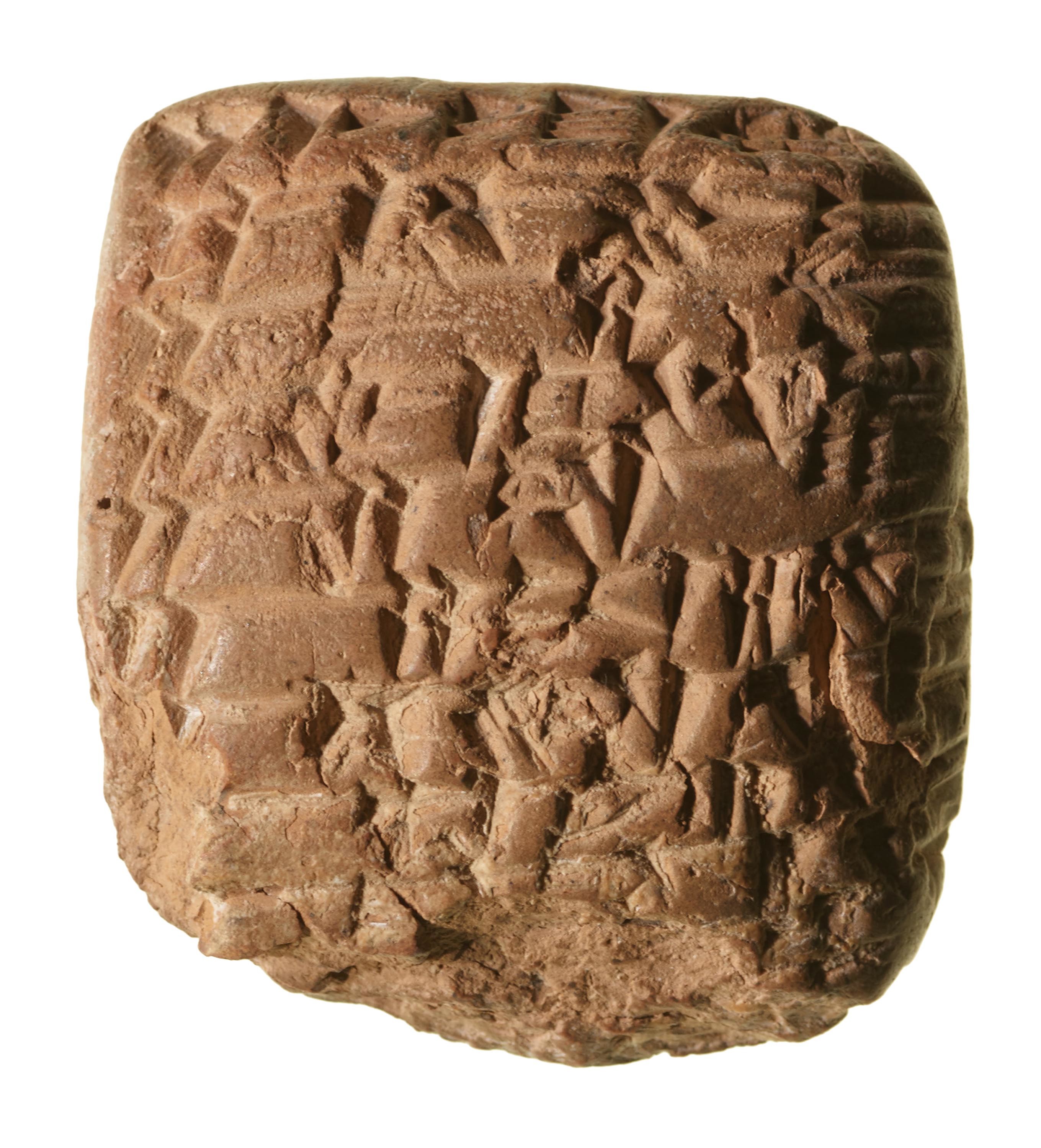
Cuneiform Tablet
2,300 BCE, Northern Mesopotamia
2 × 2 in
Small clay tablet with cuneiform writing on both sides (in Akkadian language), from Early Old Babylonian period. It displays an account of labor, specifically referring to numbers of bricks carried by workers. Translation help provided by Manuel Molina.
Admin/Finance
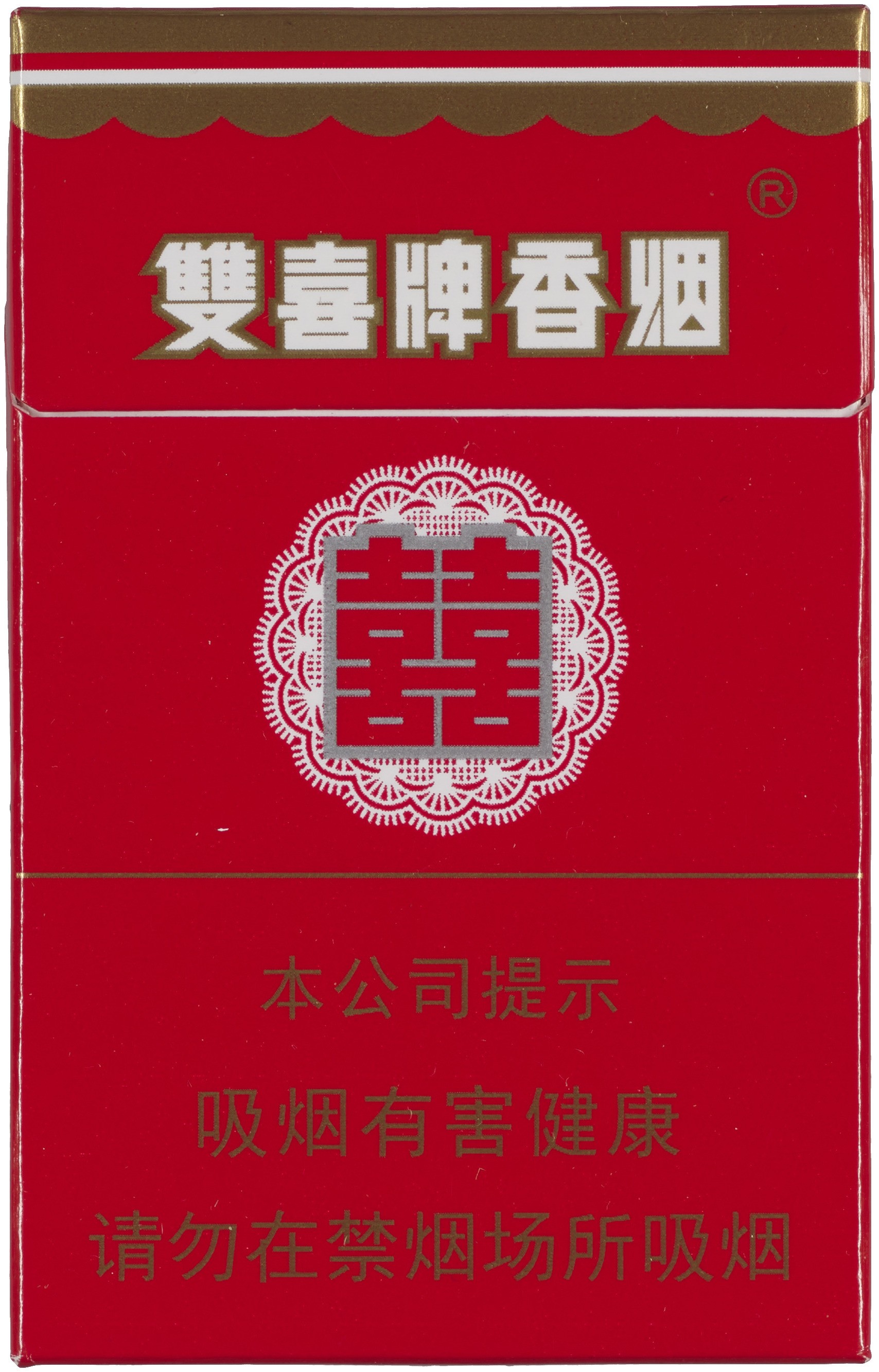
JIAZAZHI 假杂志
双喜 (Until Death Do Us Part)
2015, Beijing, China
3.5 × 2.25 in
Until Death Do Us Part [双喜] focuses on the unexpected role cigarettes play in Chinese weddings. As a token of appreciation, it is customary for the bride to light a cigarette for each and every man invited. The bride and the groom are then invited to play some cigarette-smoking games of an unprecedented ingenuousness. This publication pays homage to a tradition in which love and death walk hand in hand.
Collections
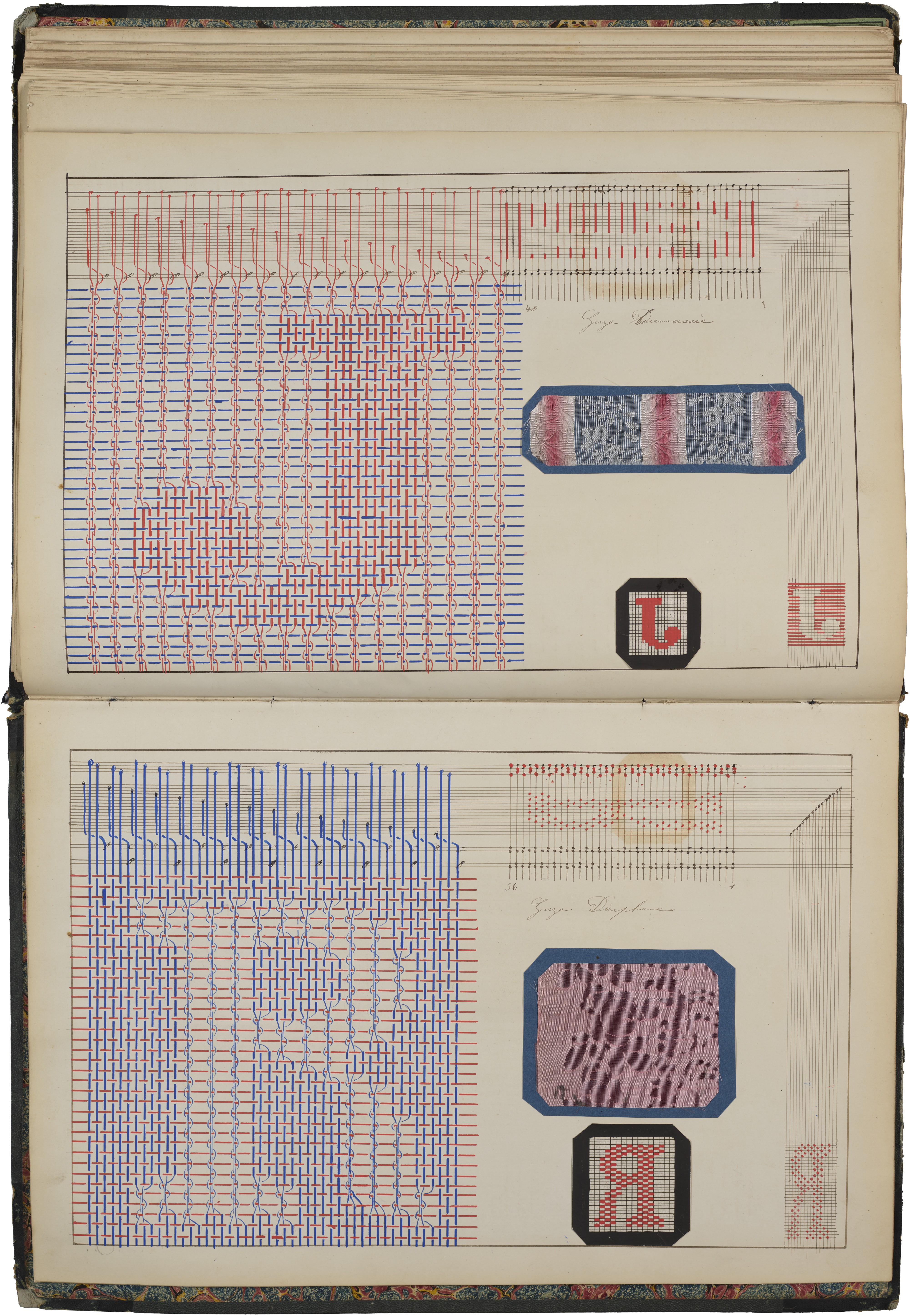
J. Richard; P. Audibert
Cours de Théorie pour le Tissage (Weaving Theory Course)
1882, Lyon, France
17.5 × 24 in
Created in 1882, Weaving Theory Course is a manuscript with hundreds of intricate hand-drawn diagrams that show in-depth instructions for Jacquard loom weaving. The book appears to be an elaborate student project produced by J. Richard in a course taught by P. Audibert. (Similar manuscripts by other Audibert pupils can be found in other collections, such as the Art Institute of Chicago.) It opens with a portrait of Joseph Marie Jacquard who first demonstrated his invention in 1804: a revolutionary loom that enabled unskilled workers to weave intricate patterns in silk. The Jacquard loom operates through a series of punched cards, controlling which cords of the fabric warp are raised with each shuttle pass. This innovative system enabled the storage and automatic reproduction of complex operations, revolutionizing textile manufacturing processes and enabling pattern changes by swapping cards. The technology is widely regarded as an early precursor to computer programming and data entry.
Along with the meticulous instructions and drawings, the book also includes tipped-in fabric samples and a set of cardboard punch cards. As a delightful addition, the title page and subsequent section separators are hand-lettered in peculiar chamfered styles of the period.
Curatorial
J.C. de Widt
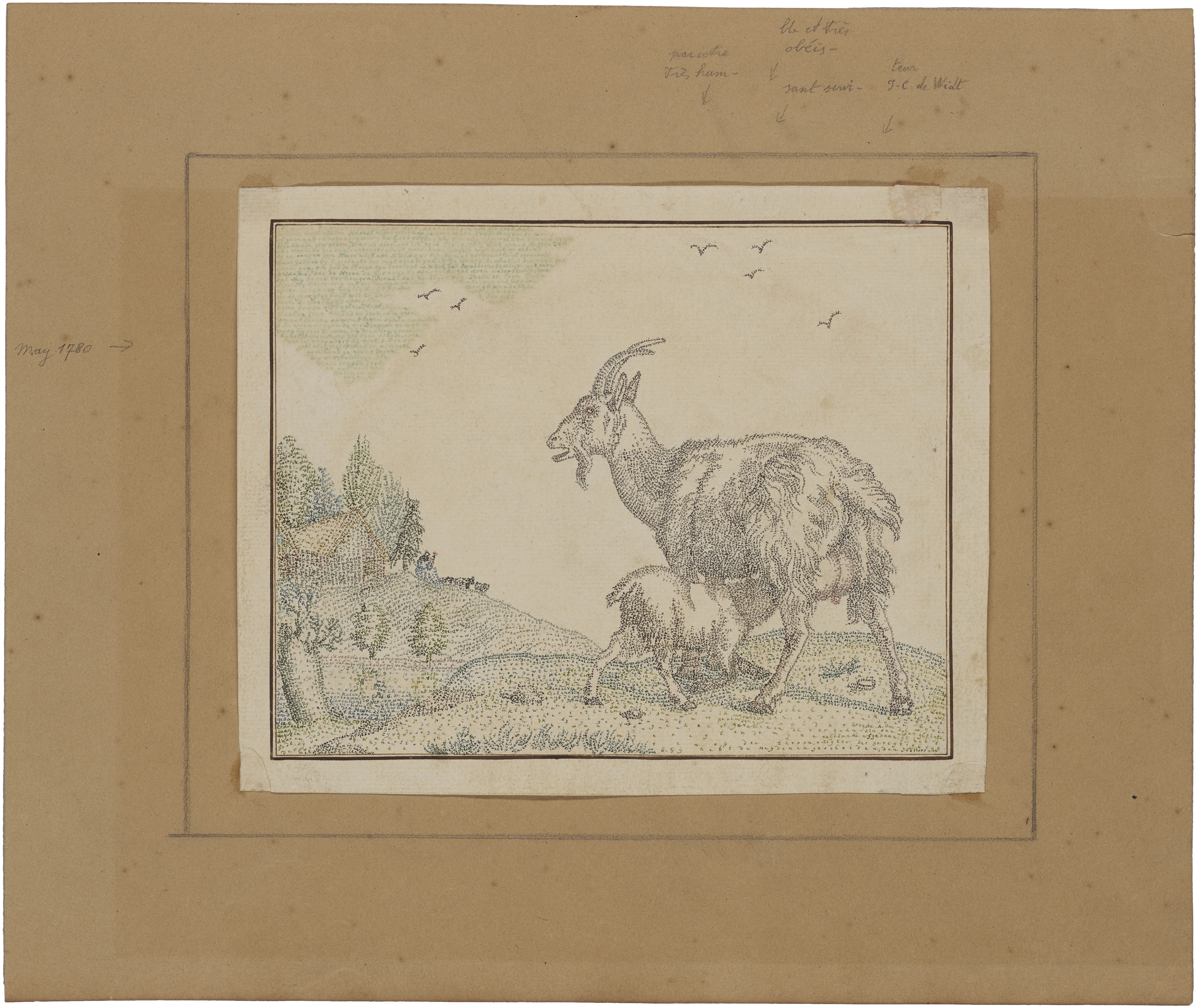
Untitled Example of Original Micrography
1780, Amsterdam, Netherlands
10.63 × 12.75 in
This item contains the smallest letters—by far. Micrography (or microcalligraphy) is the art of creating images using tiny writing. This kind of calligram has a long history in Christianity, Islam, and Judaism based on the devout observation of the second commandment against images. This remarkable multicolored piece, featuring a landscape and goat nursing its young, is made with the text from multiple psalms. Flying birds are shaped by the words “Ecrit amster-dam … May 1780.” (Written in Amsterdam, May 1780)
Education
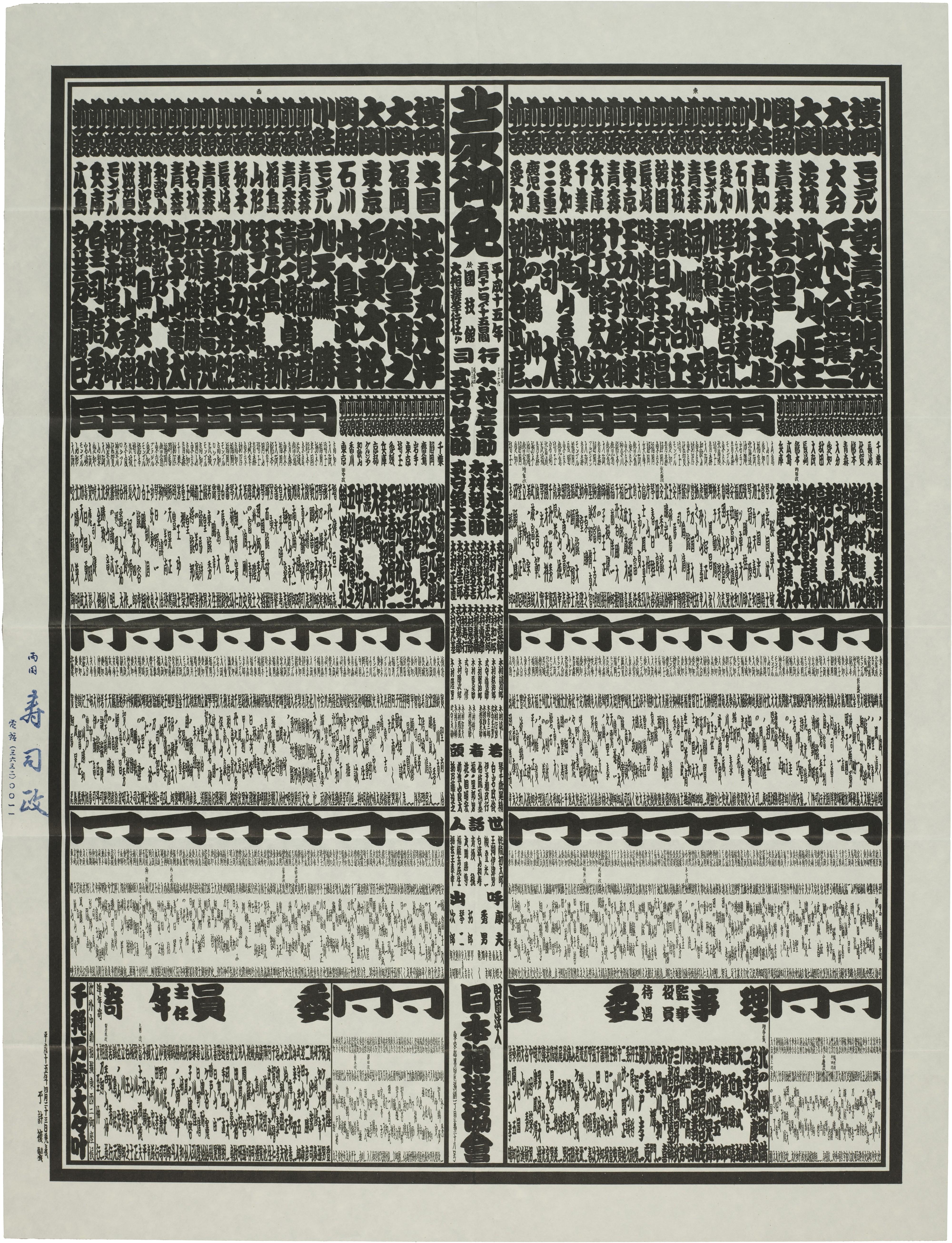
Japan Sumo Association
番付表 banzukehyō (Sumo wrestler rankings)
2003, Japan
23 × 17.35 in
番付表 banzuke-hyō is a chart listing the rankings of professional sumo wrestlers published before each official tournament.
High-ranking gyōji then take on the laborious task of copying down the new rankings on a traditional Japanese paper roll called a maki. They carefully write down the kanji characters of each wrestler participating in a tournament in a calligraphy style called sumo moji. The work is very intricate and requires a great deal of skill. It usually takes about a week to complete the document.
Exhibitions
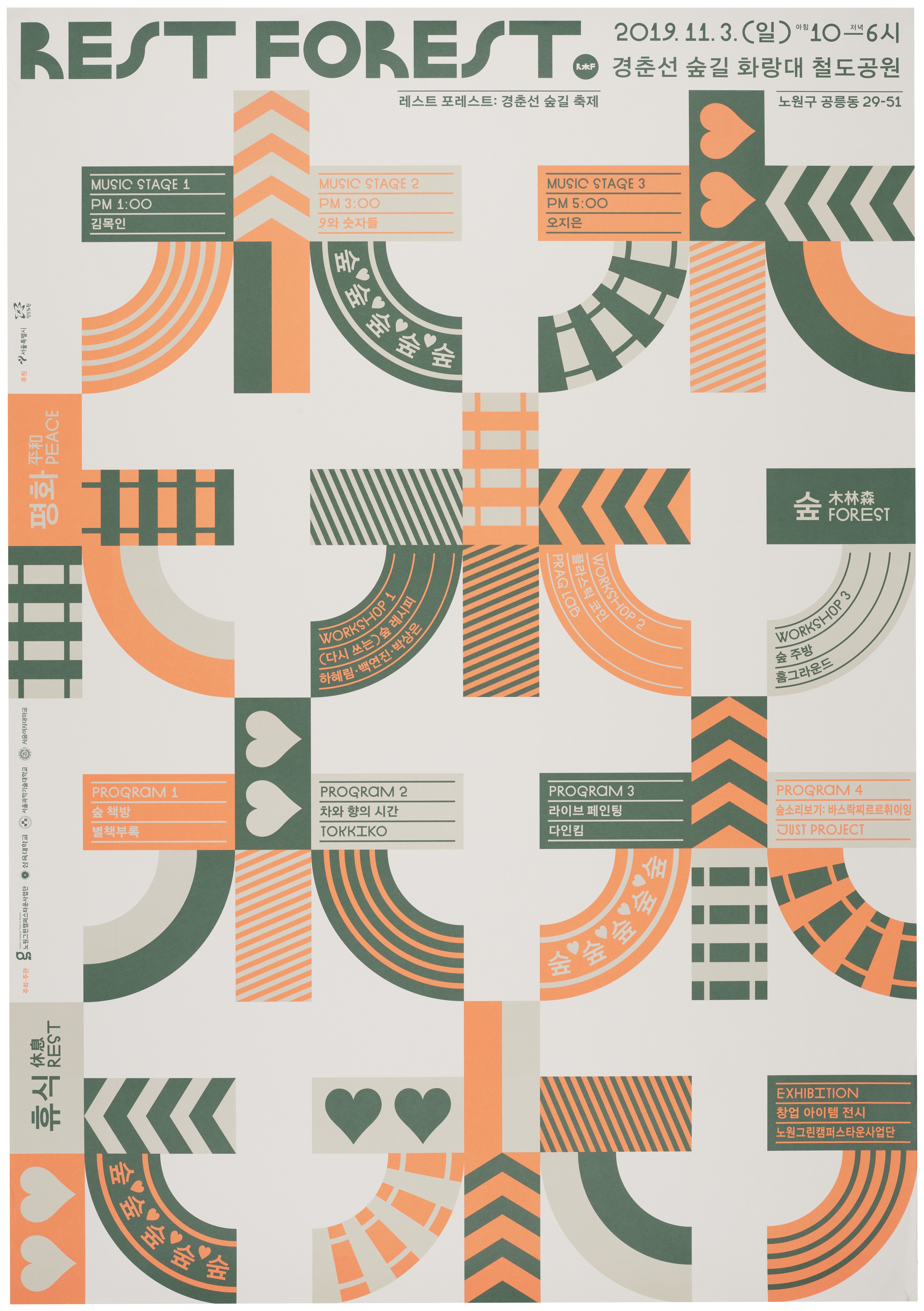
DDBBMM (formerly known as kimgarden)
Rest Forest 2019 Poster
2019, Seoul, South Korea
33.5 × 23.5 in
The exhibition team has curated a selection of objects unified by the theme of ornamental, decorative, and patterned elements. Patterns and ornaments are not just aesthetic choices; they are essential forms of cultural expression that have thrived throughout the history of design. Their versatility and imaginative power make them vital tools for communication and storytelling.
Humans possess an innate appreciation for the beauty found in patterns, a preference rooted in our evolutionary connection to patterns in nature. The exhibitions team is excited to emphasize the diverse applications of patterns. They enrich visual interest, add depth and texture, and foster a sense of cohesion in design.
Marketing
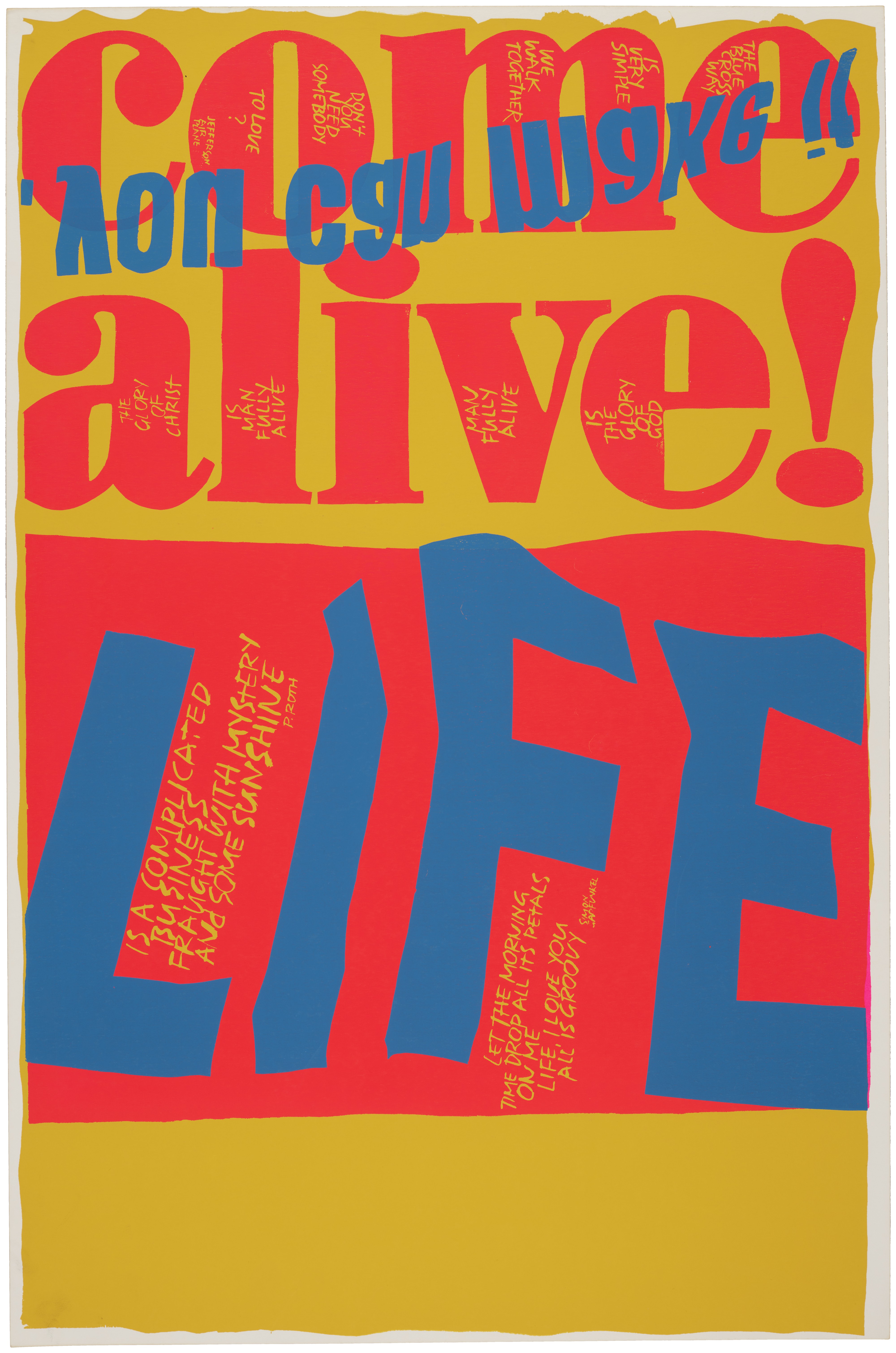
Corita Kent
Uncut Print of Two Works: Come Alive & Life Is a Complicated Business
1967, Santa Clara, California
35.125 × 23 in
Gift of Corita Art Center
Sister Corita Kent was a pioneering pop artist, educator, and Catholic nun whose vibrant screenprints blended bold typography, social justice messages, and spiritual themes. She transformed everyday slogans and advertising into powerful calls for peace, love, and activism. This print is one of several recently donated to us by the Corita Art Center. Printed by Corita’s frequent collaborator, Hambly Studios, it shows how she designed many works to be printed side-by-side on a single sheet using the same colors.
Publishing
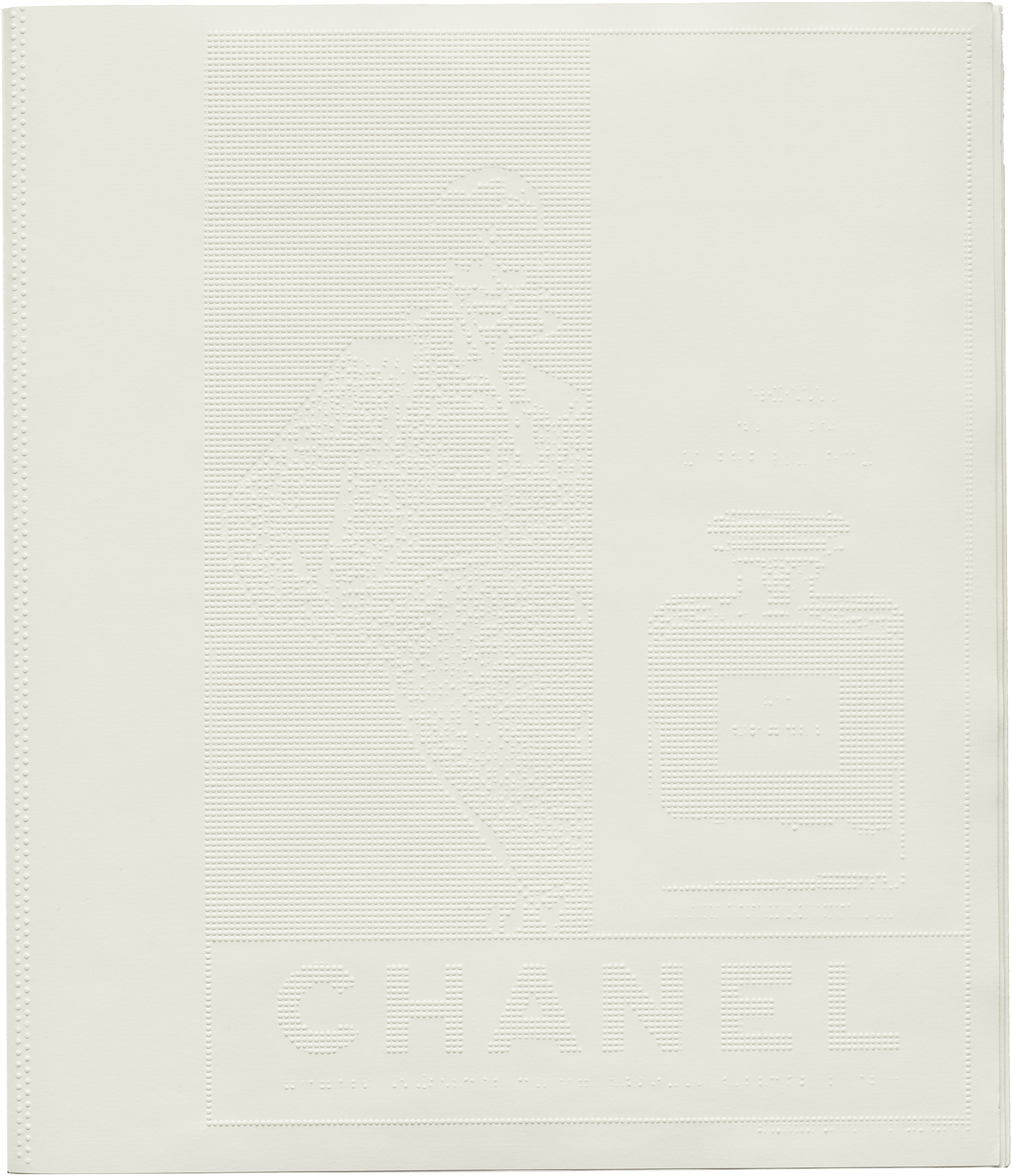
Irma Boom
No. 5 Culture Chanel
2013, Paris, France
9.75 × 16.5 in
The 300-page book has no ink—each of its crisp white pages is embossed with a drawing or quotation that helps Gabrielle Chanel’s story unfold. It is clean, understated and ephemeral, and somehow it remains totally engrossing. Making an invisible book for an almost invisible perfume made perfect sense to Boom. It challenges the idea of what a book is and can be.
Docents
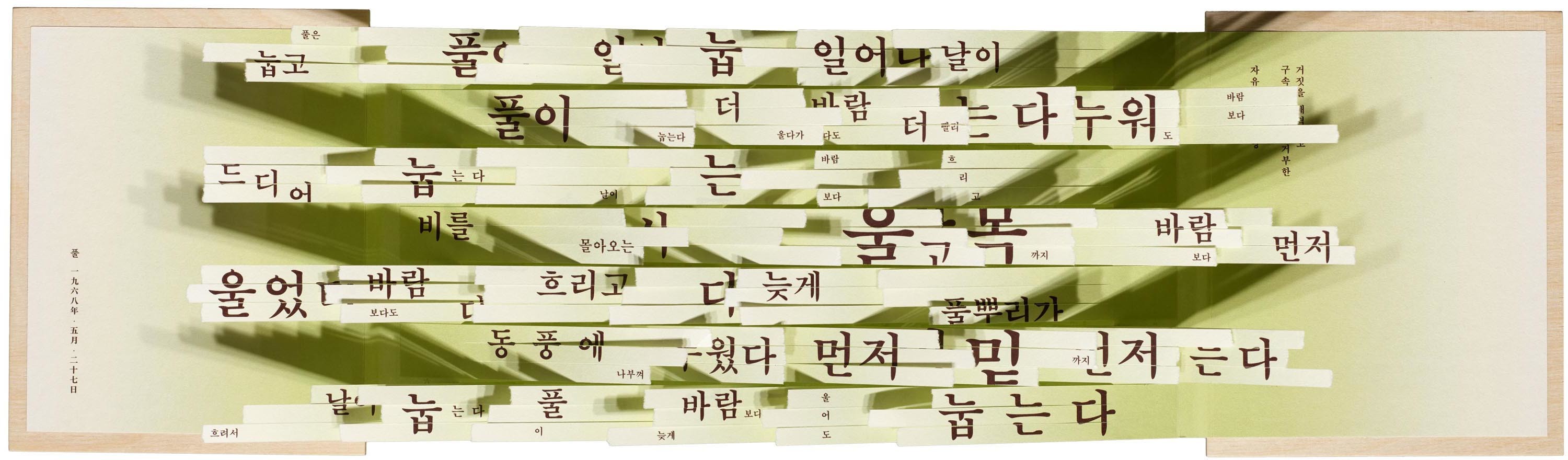
Su-yong Kim 김수영 (Author), Xianlu Yi (Book Designer)
풀, 김수영 (Grass, Kim Su-yong)
2019, Seoul, South Korea
6 × 12.75 in
Truly a highly requested fan favorite! "Grass, Kim Su-yong" is a typographic art book in which a poem composed of letters is transformed into an image through the form of an art book. Under the guidance of Professor Hyunmee Kim, Xianlu Yi reinterpreted a poem into the form of concrete poetry that freely constitutes the size and location of letters, and utilizing the forms of pop-up and accordion books to express the repeated rhythm of the poem in three dimensions.The grass is a metaphor for the people and their resistance to oppression. In the 60s, when this poem was written, Korea was under a military dictatorship.
Type West
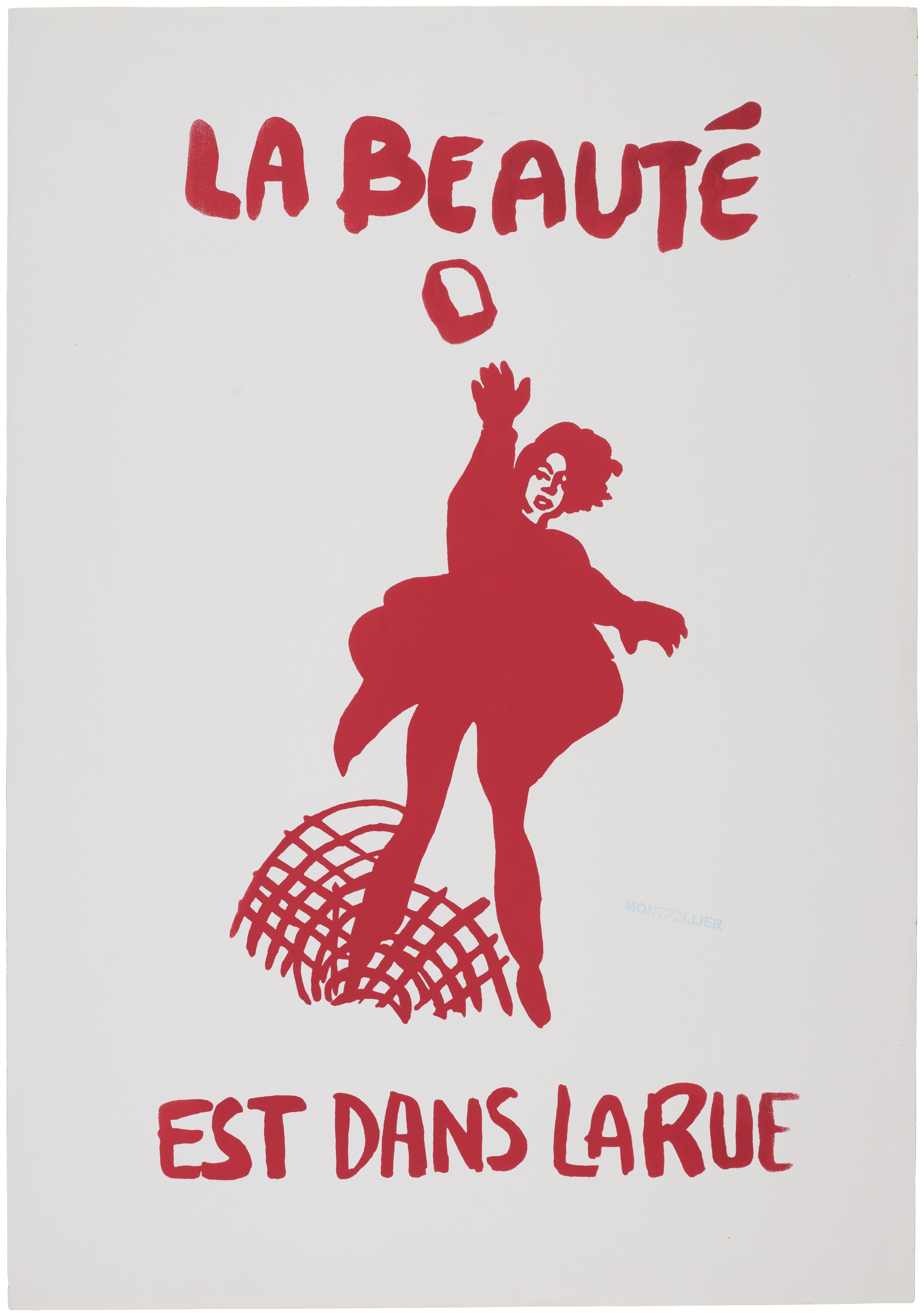
Atélier Populaire
La Beauté est dans la Rue
1968, Paris, France
24.75 × 17.25 in
Beauty Is in the Street was produced by the Atelier Populaire (Popular Workshop) in support of the May 1968 events in France. The Atelier Populaire, who designed and printed the posters, were a group of Marxist artists and art students who occupied the École des Beaux-Arts during the wave of wildcat strikes in May 1968. Using a silk-screen printing press they produced thousands of posters at a time. They typically were printed on newssheet using a single colour, and use a simple iconography in which the factory represents the role of workers in society and the fist stands for solidarity and resistance.
Explore the Exhibition
View the entire show and each teams selections here.