The Exhibition
Introduction
strikethrough: (n) the penetration of ink through paper in the printing process; (v) to draw a line through text to call for the deletion of an error
Protesters have long used typography to strike through myriad forms of oppression. Their written words call communities to action, speak truth to power, and put bigots on notice that their hate has been marked for correction.
This exhibition showcases typographic anger and agency as it is seen in the streets, on the printed page, and even on the bodies of demonstrators.
Here, the work of trained professionals sits alongside the raw creativity of activists and engaged citizens. Designers as protesters—and protesters as designers—rise from a wide range of racial, socioeconomic, and geographic backgrounds. Their audible demands are translated into visible, repeatable forms. Letters are drawn, cut, painted, and printed. Messages are disseminated via the press, digital type, and augmented reality.
Strikethrough is organized in overlapping themes that evoke the call and response of chants at a protest: RESIST!, VOTE!, LOVE!, STRIKE!, and TEACH! These objects demonstrate the immediacy that typography offers any community and cause. They show us how type gives shape to voice. And while the specific rallying cries may vary across movements and media, one refrain remains the same: the demand to speak and be heard.
resist!
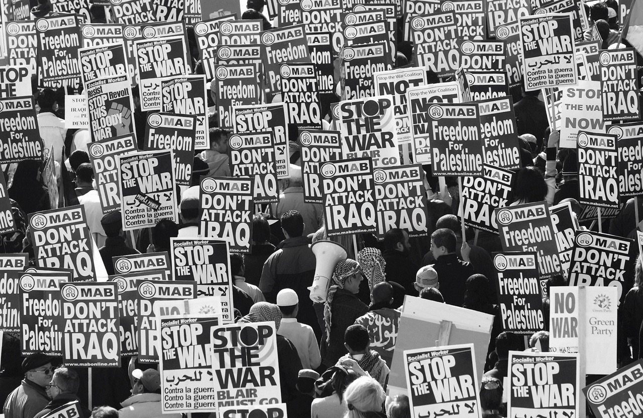
Photo: Getty Images/Graeme Robertson
strike!
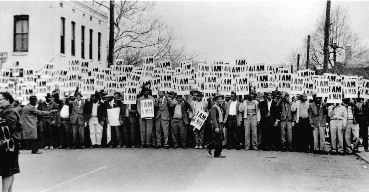
© Dr. Ernest C. Withers, Sr.; image courtesy of the Withers Family Trust
vote!
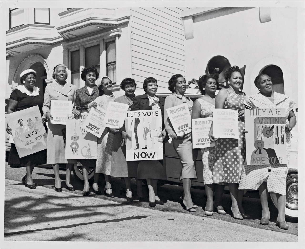
Photo courtesy of the Smithsonian National Museum of African American History and Culture/Cox Studio
teach!
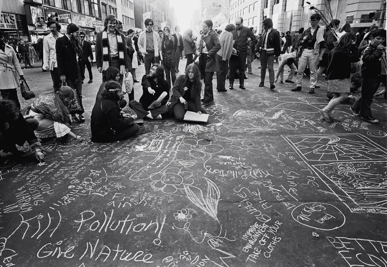
Photo: Getty Images/Santi Visalli
love!
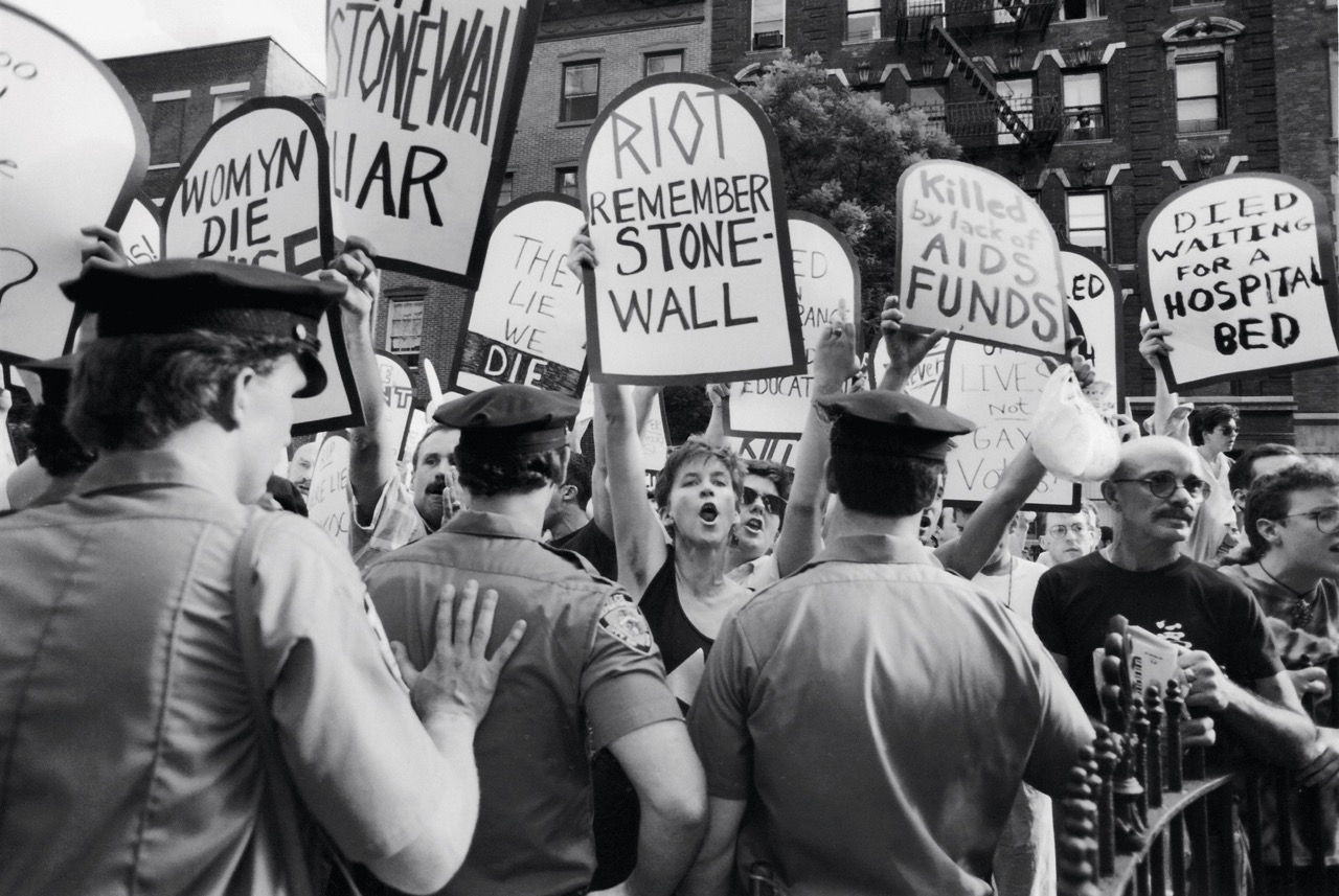
Photo: Getty/Newsday LLC/Erica Berger