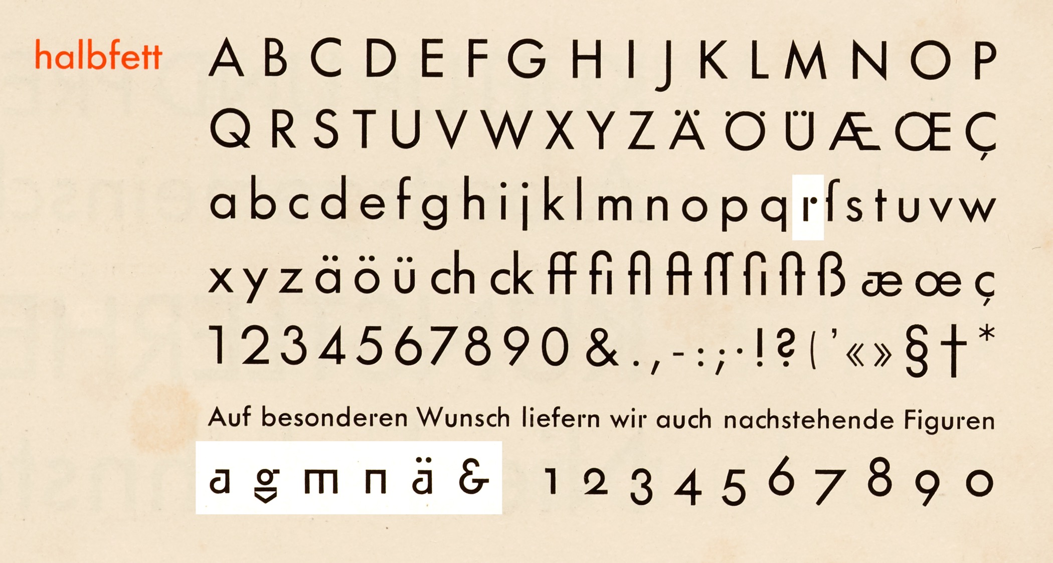
Today, Futura is one of the most popular typefaces, used everywhere by advertisers and artists alike. But at the time of its release in 1927, Futura was on the cutting edge of experimental, geometrically derived typefaces. Eschewing the lettering origins of most sans serifs (grotesques) of the era, Paul Renner based Futura on elemental circles, squares, and triangles in a bid for modernity suitable to the machine era. Though the timing of its release meant that it appeared in only one or two late Bauhaus productions, there are certainly similarities between Paul Renner’s Futura and alphabets theorized at the school.
Renner’s aim to construct letters with geometric shapes was most striking in the alternate forms for a, g, m, n, and the standard form of r. All of these were eventually replaced with more conventional forms to appeal to a broader audience not yet ready for such radical reshaping of the alphabet.
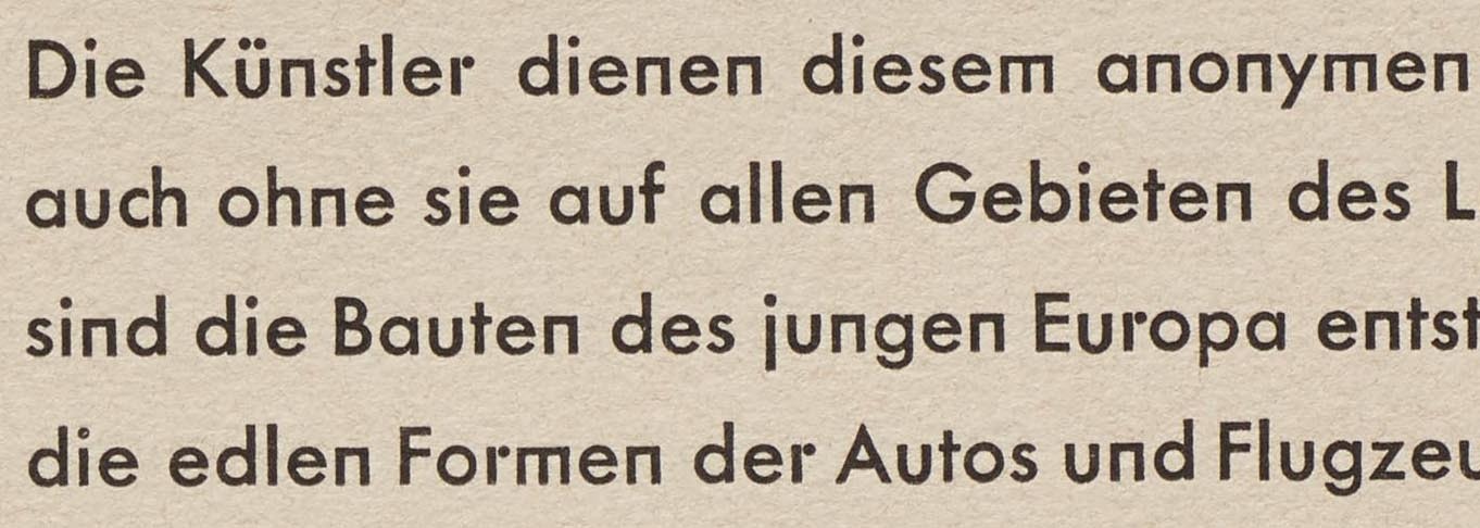
Still, samples in Futura’s first specimen demonstrate how even the minimalist m, n, and r are surprisingly readable in paragraphs of text.