Walkthrough
Inside Offset: Two Experimental Bauhaus Alphabets

Joost Schmidt designed this 1926 cover for the special Bauhaus issue of Offset, a trade magazine that showcased the newly affordable four-color printing. The cover titling represents a geometric ideal that couldn’t be fulfilled by type, as fonts in this highly rationalized genre didn’t exist until Erbar-Grotesk and Futura came along later in 1926 and in 1927. He created the now-iconic design when he was a Bauhaus teacher of lettering, just one year after finishing the school’s sculpture course and two years before taking over its print and advertising workshop.

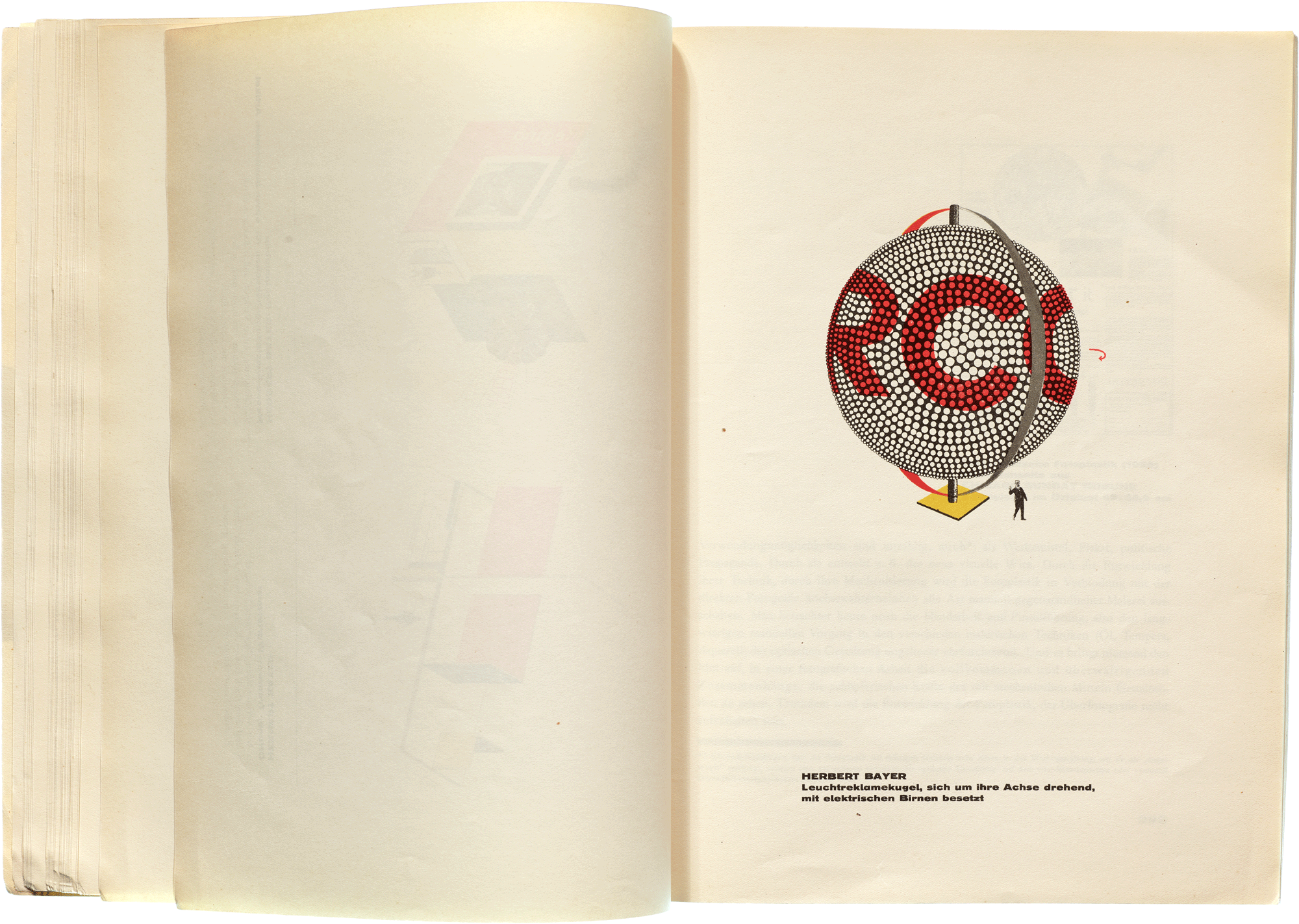
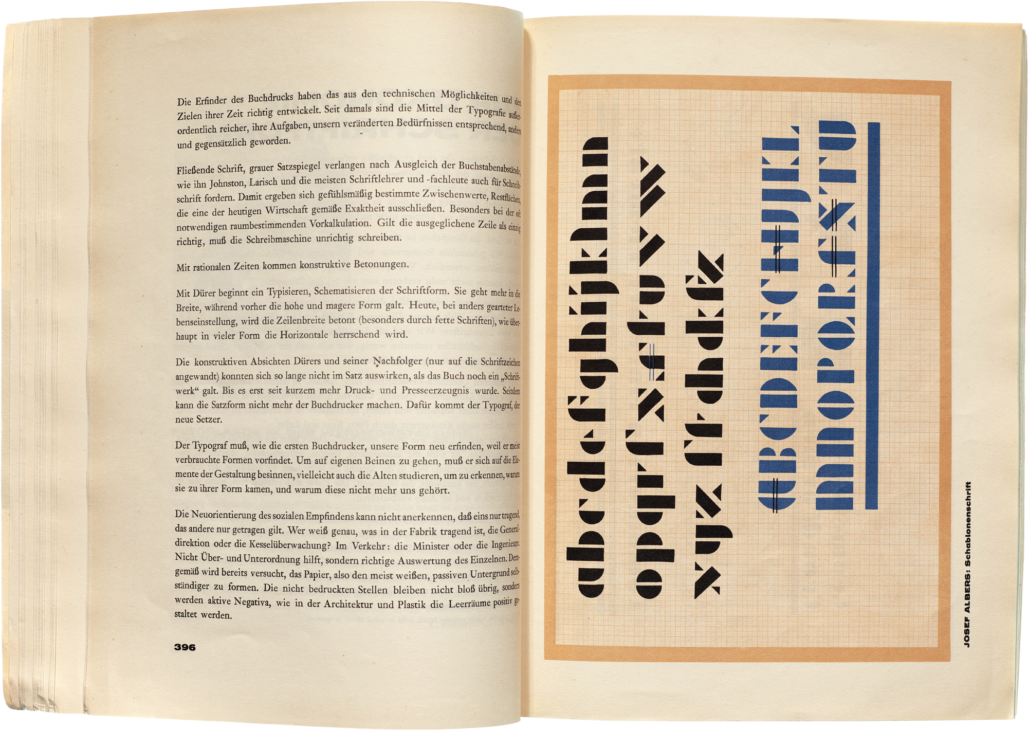
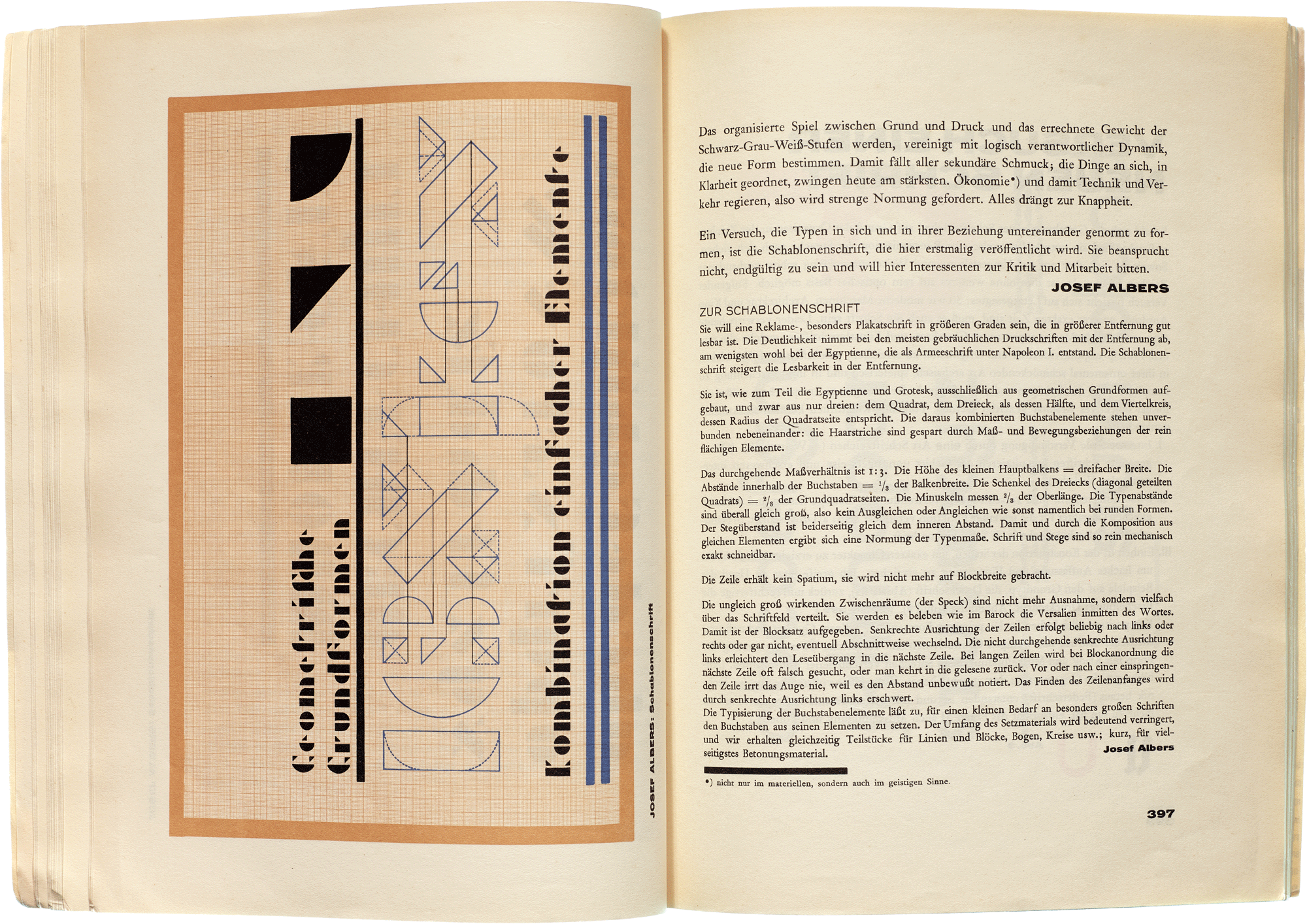
In addition to showcasing Bauhaus projects printed in multiple colors, this issue of Offset includes early coverage of two experimental Bauhaus alphabet designs. The first is one of several stencil alphabets designed by German-born painter Josef Albers, who was a student and then a professor at the Bauhaus. His typeface is modular, meaning that a limited set of identical shapes mix and match to make up all letters. In this case, Albers built his alphabet out of three forms: a square, a triangle, and a quarter-circle.
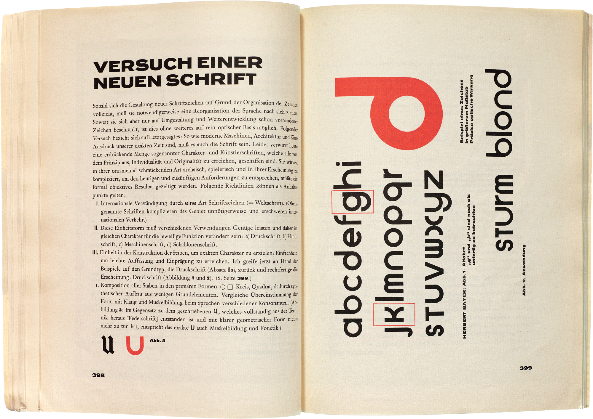
The other typeface featured in the issue, Universal Type, is Herbert Bayer’s attempt at a completely rational typeface—one derived from geometry rather than handwriting and therefore ostensibly better adapted to industrial production. It also eliminates the use of two sets of distinct characters for uppercase and lowercase. The design was especially radical in light of the rise of National Socialism, which presented Fraktur as the only so-called authentically German style (as opposed to the serif or sans serif roman typefaces).
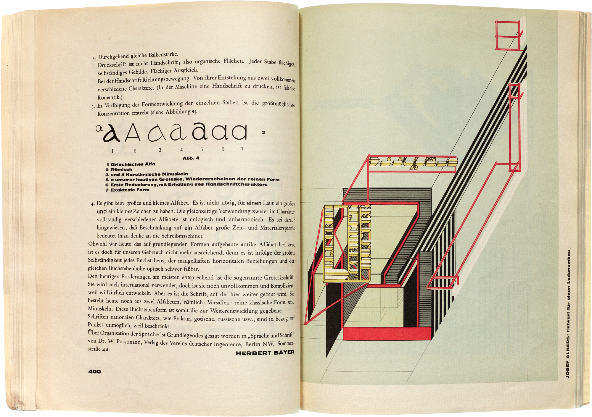
While neither typeface design ever saw production in metal, both greatly influenced later experimental alphabets and inspired several revivals. In the late 1960s and early 1970s, almost every phototype and transfer lettering company came out with its own take on the minimalist, geometric style. Ads, album covers, book jackets, and posters of the era were filled with typefaces like Harry (Mary Goldstein, VGC, 1966), Burko (David Burke, Headliners, 1967), Blippo (Joe Taylor, FotoStar, 1969), Pump (Bob Newman, Letraset, 1970), and Bauhaus (Ed Benguiat, Photo-Lettering, 1969). The latter become ITC Bauhaus, a large and popular family that, despite its name, is the furthest departure from its Universal Type inspiration.
More Walkthroughs
Explore the exhibition through video, interviews, and interactive tours of selected objects.
More walkthroughs are coming soon. Sign up to be notified.
For much more background and historical context on the material featured in this exhibition, get the catalog.